Wareable case study
Wareable is a brand new content-based site devoted to 'tech for your connected self'. Launched summer 2014, Wareable has become the leading authority on wareable technology providing news, reviews and in-depth features. Within months of launching Wareable has secured its' place on the first page of Google results for many wearable topics, often ranking first or second.
Project
Design and brand an entire content site for wearable technology in one month, as a side-project. I was briefed on the project in late-May 2014 with the site due to go live in the first week of August. As a new CMS was being built for Wareable, the project was not a simple Wordpress theme design.
Goal
The brief was to create a site with a fashion focus. Wearables are worn, they are personal, intimate and increasingly becoming accessories (and are often designed with fashion in mind). With this in mind I researched not tech sites but fashion sites. We made decisions to arrive at the final brand and style that reflected this ethos.
Team & role
I was based in London with the site editor while the product owner was based in Berlin and the two developers in Winnipeg. My role was to construct the responsive wireframes early on and document the styling & brand in a final style guide.
Outcome
The site styling is black & white, using blue as a secondary contrasting colour for hovers and other interactions, while also being the primary brand colour off site. This along with the choice of typefaces was to set a tone echoing fashion journalism while still being accessible and contemporary. We launched on time, although a few features needed to be added and styling bugs sorted out in the weeks and months after.
The process
Wireframes
After a briefing with the editors, the project began with sketching and wireframes of the initial responsive site design and layout structure of the various story forms. The backend and CMS were being built at the same time, with the expectation that the signed-off wireframes would used early on to construct the templates.
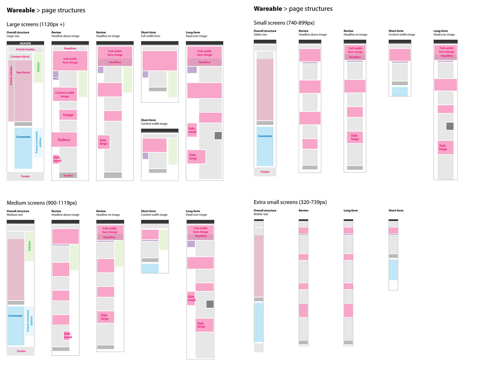 In addition to a grid, an overview of the page structure was designed in order to illustrate how content modules would change for different breakpoints
Prototype & iteration
With the grid and page hierarchy taking shape, I create a simple HTML prototype using some real content to explore how the page elements and grid would change when the browser was resized & rendered on different devices. This also helped me demonstrate the typography options as they would be read on various screen, how the responsive layout changed, and simple interactions with the navigation, gallery and search.
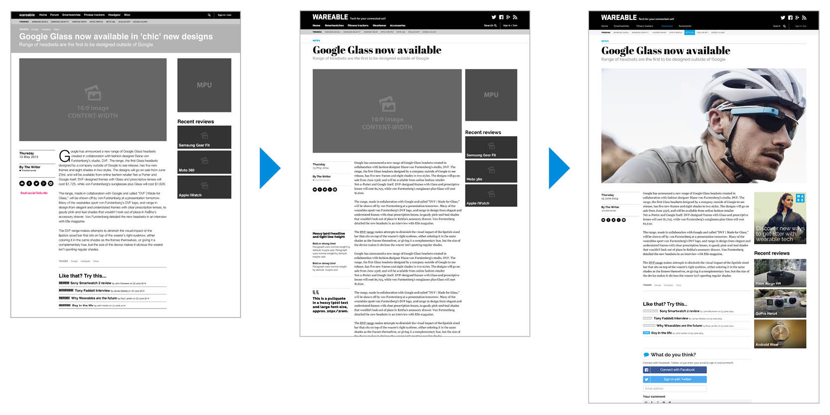 Three stages of the design evolution from early layout to branded mid-fi wireframe and finally a hi-fi mockup with real content
Design & brand
Once the wireframes agreed upon, the next step after documenting the templates for development, was to design the brand look & feel, and the site’s UI, image use and typography.
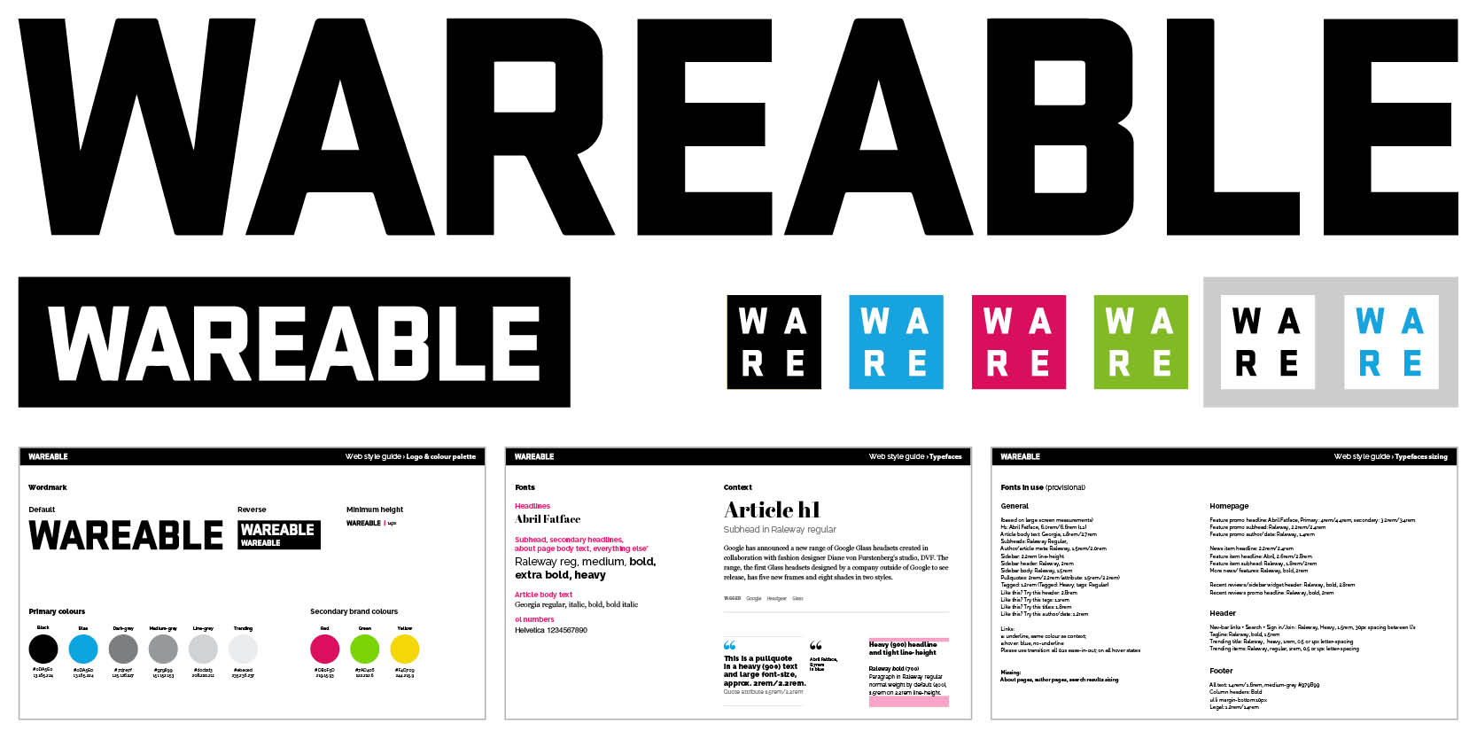 The Wareable wordmark, logo, colours and styling guide
Styleguide
While my work was far from done, the bulk of the design phase was complete when I handed off the style guide to the development team at the start of the built. During the build phase, I joined the daily standup over Skype which allowed me to answer questions and clarify the design.
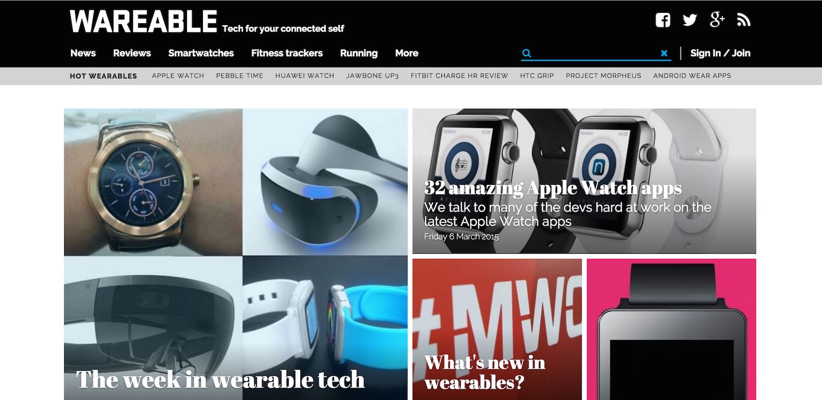
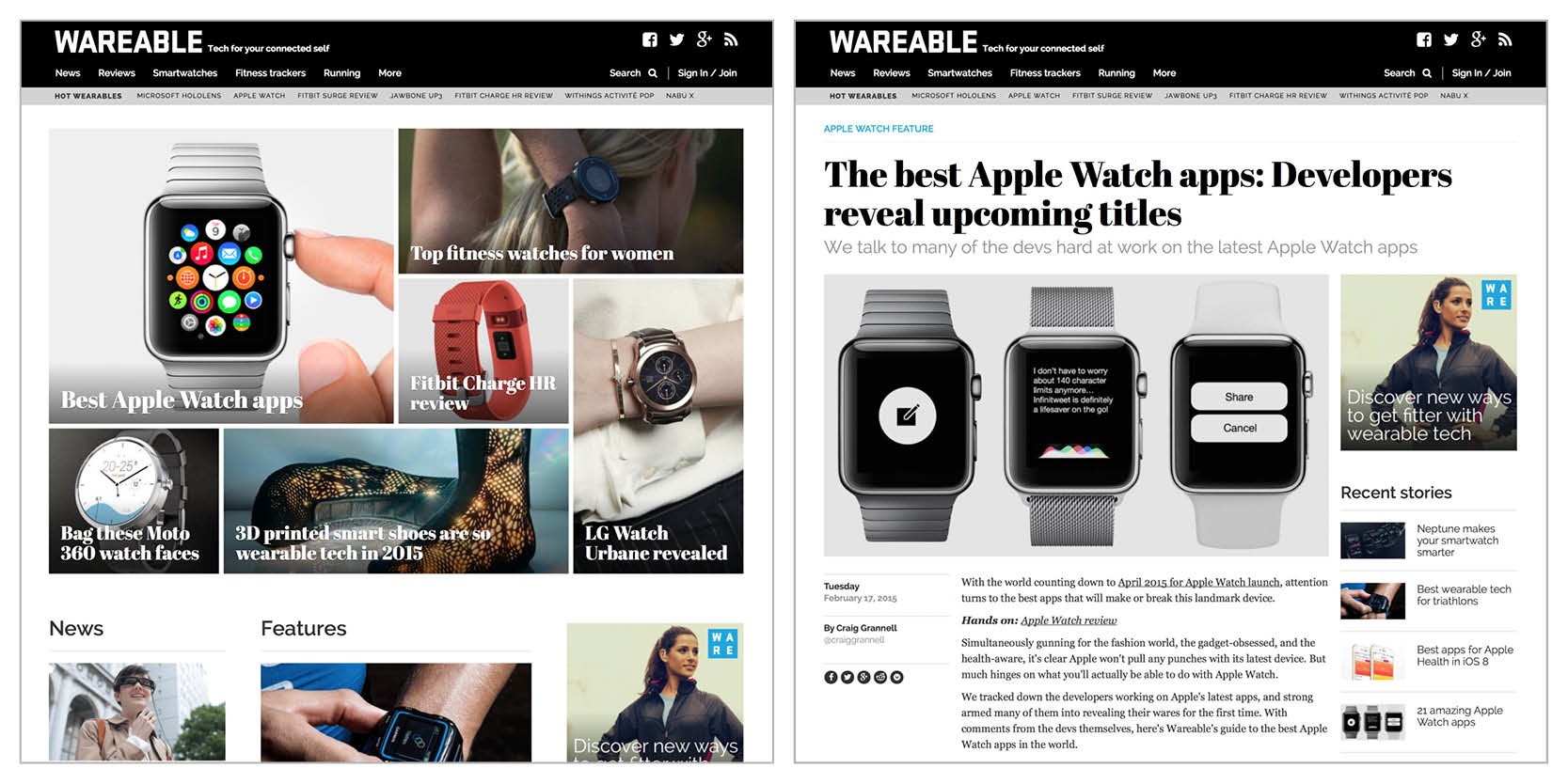 Final homepage and article design