Prototyping with SwiftUI
At WWDC2019 Apple introduced their SwiftUI reactive UI toolkit, a welcome and modern way to layout apps across all Apple devices. At introduction, SwiftUI was missing some features, and still is at the moment. However, full-featured apps can be made with the current SwiftUI (and the next WWDC is only a month away).
While the old approach using Storyboards could have been perfect for designers to adopt, complexities with auto-layouts and an understanding of how the view controller works required a deeper knowledge. SwiftUI replaces both the Storyboard and code in the view controller file. While SwiftUI only leaves us only with code, the amount of complexity is night and day.
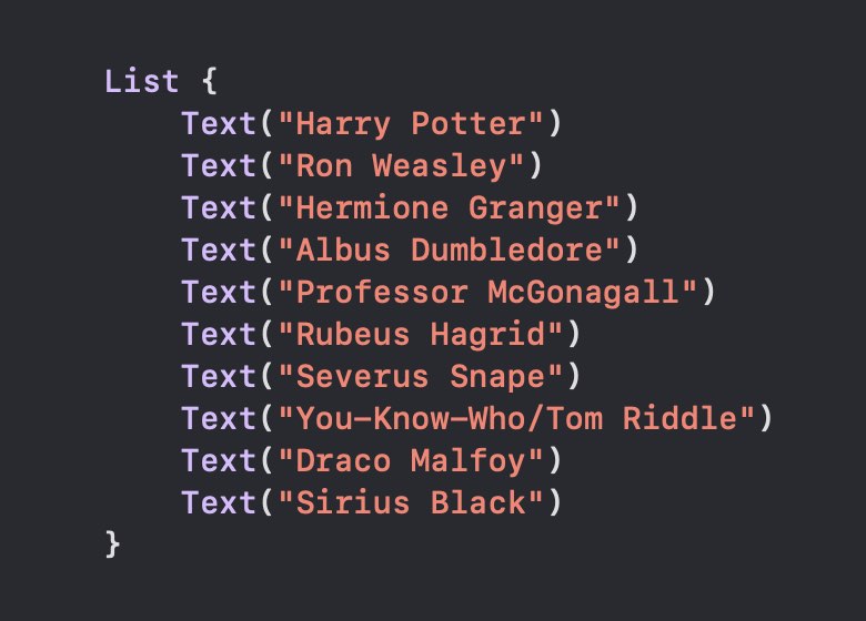
Take for example the most basic component of most iOS apps, a list. Until now, you needed to write several functions to create and populate a tableview in order to get started. Making any item on the list link to another screen required even more complex code. With SwiftUI Apple has introduced the List container, and laying out a column of data is now simple as:

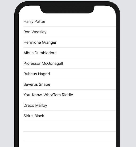
Every new item gets its own row just as a tableview:

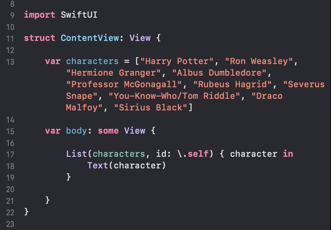
Or you can set up the List to display a sequence of items in an array:

Simply put, it is possible to layout the front-end of an app and even hook up a few bits of fake data into a working prototype. With slightly more work than setting up a prototype of Sketch or Figma images, you can be conducting usability tests with full functionality.
The power of usability testing
One of the most important tenets of design thinking and design sprints is the validation stage. As designers we are aiming to identify a problem and offer a solution. Putting the solution in front of people is a quick and surefire why to validate an approach before spending time and money building it out.
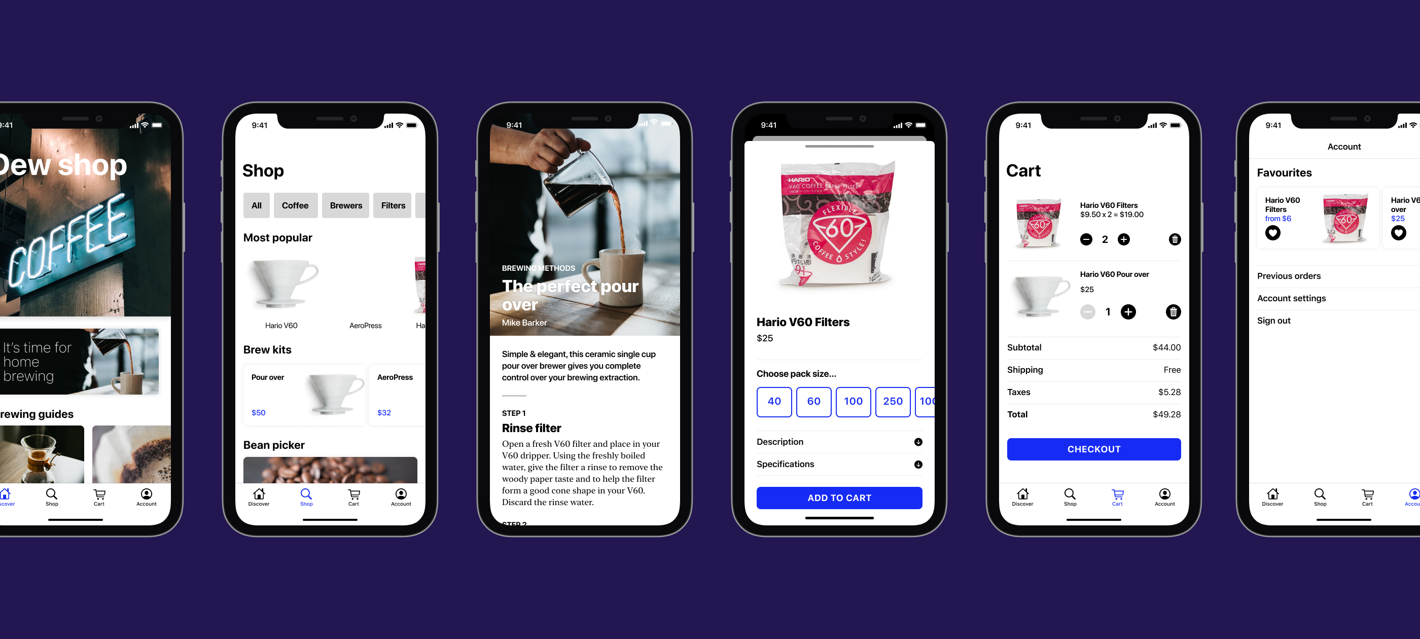
In late 2018 I started the redesign of the Canadian Tire mobile app. The product, design and development teams worked through a series of sprints to create the core ecommerce experience. We came up with new approaches to common patterns, and made sure to validate our designs with around ten people per testing round.
Had SwiftUI been announced one year earlier, I suspect I would have created the prototype in SwiftUI specifically for usability tests. There are currently a few limitations, however the prototype would have been more real and testable compared to the Invision prototype.
One discovery we came across in building out the prototype for our first usability tests was that the limitations with Invision meant we couldn’t achieve the exact interactions we had designed. At least one feature, a horizontally scrolling list, failed testing partially because there was no ability to interact in the prototype—without the app responding as intended, the feature was ignored. What could have been made in code was impossible using most prototyping tools. Yet creating that same interaction in SwiftUI now only takes a few lines of code. Of course that one interaction was just one feature in a larger test, so using some of the micro-interaction prototyping tools would not have worked either. While the feature failed to get the response from customers that we intended, not building it in the live app saved several days of dev time.
Working in tight sprints, we had little time to craft complex interactions in the prototype, and some were impossible to do altogether. We built upon the previous sprints, eventually extending the prototype to a full end to end shopping happy path. While we used real product data in our designs, we were limited by the number of static products screens to show. This created very contrived tasks for testing, often involving Instant Pots. Towards the end, the prototype became quite large and complex when testing the full shopping flow with all the many variations.
The say goes, don’t show your client an option you don’t like because they will pick it. If you have an answer to the question, ‘well which is your favourite?’, then you know the one option to show. But sometimes deciding between two relatively similar solutions can be difficult. With so many subjective reasons for picking one design over another, the best gauge is whether the solution works for the customer.
Five or more years ago I probably would have answered, ‘we will A/B test these two options then’ when in realty we built A and never had the time or resources to build B. Now I would say, let’s test A with a prototype to see if it passes, and iterate if it fails (and that might not mean going with B). That’s overly simplified—a test to ensure an interaction does not fail may not optimize for the best conversion, but at least it won’t be the major blocker that destroys your app.
Get started with SwiftUI
There are a lot of excellent Swift and SwiftUI resources out there on YouTube, Udemy, and devoted sites. Apple published a whole series of tutorials on the Apple Developer website. The initial batch of tutorials were missing many of the components that make up full-featured apps. It has taken many of the top-notch developers in the Swift community to document some of the hidden gems in SwiftUI, at least for us mere mortals unable to read Apple documentation correctly.
I could certainly not get anywhere without Paul Hudson at Hacking with Swift, or discover who’s pushing the limits of SwiftUI in Majid Jabrayilov’s SwiftUI Weekly newsletter. There are plenty of videos on YouTube worth checking out, or take a Udemy course. And of course Designcode is an amazing learning resource.
What I want to focus on is building a working prototype that can at least be installed on an iPhone and tested with real people. This is a longer-tail goal, and will best when we can be close to other people again. (Though I will be investigating using the existing third-party tools that can be embedded in apps, and of course deploying the test app via TestFlight).
I have crafted a number of typical apps scenarios with a basic design that are easy to achieve in SwiftUI. Follow along as I build a rough prototype, then add in just enough data and interactions to make it real. I will soon speak to my design process when crafting these apps, and how there were multiple design options for many of the screens. My aim has been to pick one, and include those hypothesis as part of a future usability test. I am particularly curious in general around how people respond to, and interact with opening additional screens via the new Sheet that came with iOS 13, particularly on dismissing the view.
A word on ‘front-end’
There really is no parallel paradigm between web and app ‘front-end’ development, however I believe there should be some allowance for this. Most app developers are full-stack already, but designers find it easy to dabble in a little html, css and possibly even javascript. Some designers have gone as far as understanding how to get React to work (true geniuses in my opinion). Apps are expected to deliver stellar experiences which require a fine attention to detail in building the views. It is quite possible to layout the front-end of an app using SwiftUI and display basic data—effectively a SwiftUI version of your Sketch/Figma exported PNG. Designers don’t necessarily need to make production ready code, however laying out a design on a real device is an important step in ensuring quality. As for a team of developers, there’s a lot of potential to split roles with one developer focused entirely on the ‘front-end’ experience in the app (the UI logic), while another works on the business logic.