Refash
Fashion rewards platform
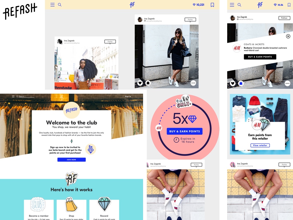
Refash was a fashion shopping rewards platform that used influencer-created fashion inspiration looks as engaging content that members would come back to repeatedly. Whereas other rewards are used if and when the customer remembers, our solution was to leverage Instagram fashion posts adding an interactive information layer to make looks buyable. The question 'where can I buy that outfit?' came up in our research of Instagram users, so we built the shoppable look to leverage Instagram, making reward points a secondary feature.
The challenge
Refash was an opportunity to test whether the shopping rewards platform could reach a whole new audience by focusing on a single vertical in an otherwise untapped market segment. By selecting fashion retailing, we determined not only to target a product that would resonate with then current trends, but contain a habit forming killer content feature. It was a whole new approach to an existing by not wide-spread product, and this allowed us to work differently and with modern product methodologies (theory of change, product canvas, design sprint).
The role
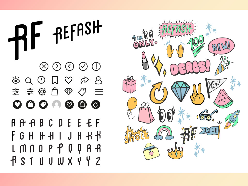
I designed the wireframes, built the prototype for our usability testing and applied the final UI styling to the screens. We had contracted out the brand design which included the logo, custom typeface, icons and stickers. I also contributed to the initial user research.
We started with a team of four (product manager, fashion marketing specialist, developer, designer), before enlisting an additional front-end superstar to help us launch, and an affiliate manager to set up our retailer relationships.
Research
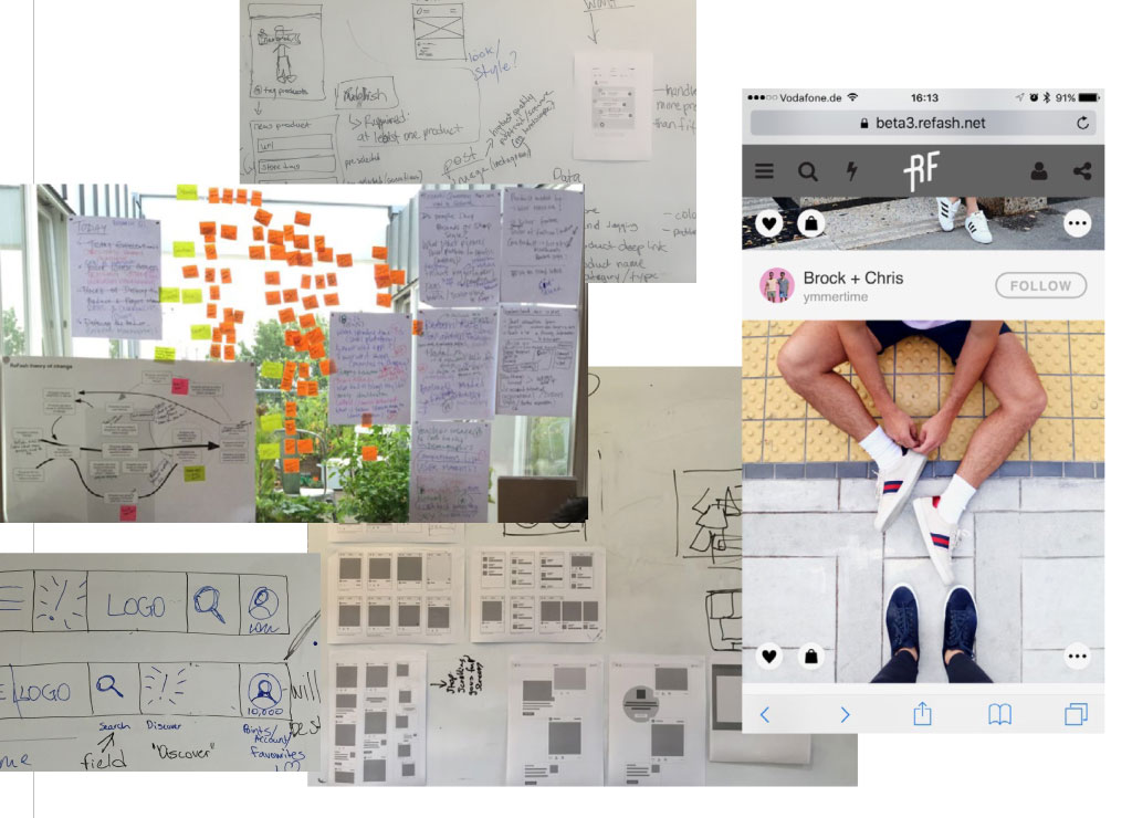
Before the team was fully assembled and we began the process to define the product, I set about gathering research and conducting tests to get an understanding around consumer perception with cashback and reward points. I had previous experience running usability tests on Quidco, and without even a prototype to observe behaviour, I conducted a series of interviews, and ran an online survey to get general understanding, expectations, and brand & product awareness. I finished by compiling and sorting the results, along with a competitive analysis, into rough pen portraits for typical customers and their habits.
Our process
We eventually used a design sprint to design out our main feature, however we started at the beginning using the Theory of Change to define the initial problem to tackle, a shortcoming among similar products—creating a sticky feature. Using our research we determined our target customer’s behavioural patterns and how to create a core feature that was most likely to engage them. With the goal set, we researched potential customers, their shopping and internet behaviour, before determining our target demographic.
Only then with an understanding who we were designing for and what behaviours we needed to understand. We started our design sprint with a much tighter brief, focusing our energies on one feature that would make our product stand out. The design sprint ended with a quick prototype that we used to validate our idea so we could proceed with confidence.
The design sprint led to a design phase where we wireframed the overall customer journey while conducting further research into the content creators we would need for our platform. At this point we hired a branding designer to focus solely on creating a brand that would speak to our audience. Once the initial brand was nailed down with logos, colour and UI assets, we moved on to stickers and other assets identified during the build.
UX solutions
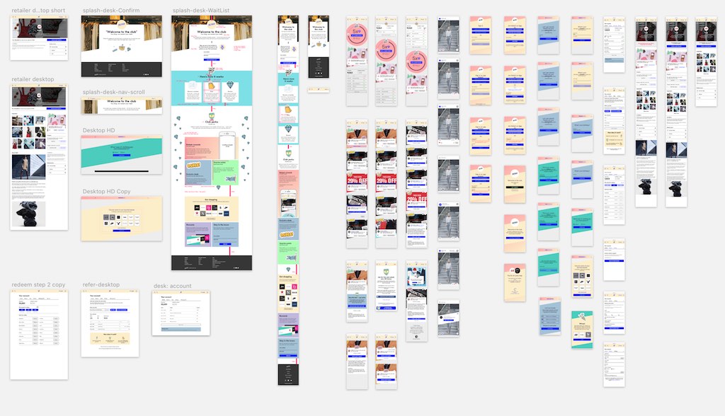
From the beginning our aim was to be mobile first. Almost all initial wireframes were sized for mobile, and the first iteration of the front-end was mobile only. We built our prototypes for mobile and ran our tests on mobile. While we had a sense of how the app would look on desktop, particularly the movement of content to the wider viewport, I did not begin desktop desks until well into the project when the front-end developer needed them.
The shoppable look
The team focused most of our efforts on creating the shoppable look, a feature that leveraged Instagram before their own shoppable post. Fashion influencers would be able to not only import their existing Instagram photos, but tag clothing items with deep-links to the real products. Our rewards platform would take over from there. We would follow up by unlocking this feature to all customers.
The shoppable look solved two problems we had identified. The first was our initial goal—to create a feature that would make Refash a destination for fashion shoppers. Unlike similar reward products, we would create our traffic based on content rather then a simple directory. The second reason was discovered through our research into fashion apps—far too often fashion influencers only shared a look with some brands seldom tagged. We kept finding great looks but couldn’t then find the outfit.
The competition was split. Instagram wasn’t allowing product tagging, one app that did was complicated and didn’t leverage the platform popular for influencers, and one that gave rewards lacked the content entirely. We had identified a unique opportunity that would be explored eventually.
Core reward shopping experience
Refash’s core feature is of course the rewards platform, giving customers points for purchases made through our affiliate links that could be redeemed for gift cards at their favourite fashion retailers.
The existing engine built for Quidco, Qipu and Shoop relied on paying out cashback, a mechanism we found not all customers understood (or it was a matter of perception). Prior to beginning the project we conducted a series of multivariate tests to find which method resonated with customers best, pitting points against pure cashback. Points won easily with a statistical significance.
Some modifications would be required to enable the backend code up to work in points, and we had some bandwidth to take a fresh approach to the collection and redemption experience.