lululemon back in stock notifications
lululemon, the popular global athleisure brand headquartered in Vancouver
Role
Senior Product Designer
I was contracted by the Vancouver athleisure company to collaborate on a better out of stock experience. Working with product, UXR and development, we took a frustrating dead-end shopping experience and turned it into a positive opportunity for guests.
lululemon guests had become increasingly frustrated with popular products being out of stock, and with not knowing when or if products would return.
UXR had previously identified in their foundational usability testing that customers would become stuck when an item they wanted was out of stock. The Guest Experience team was receiving feedback and calls with customers inquiring on when products would be restocked. In late 2021, a team was assembled and project budget approved to a solution to be built. I came onboard in January 2022 as a round of moderated competitive usability tests were being completed.
Impact
Usage: target was met ahead of schedule, partly due to better targeted related products engagement
Re-engagement: accounts engagement increased and dormat accounts were reactivated to use the feature
Demand capture: better backorder forecasting based on guest intent
"Hybrid" designer
When I started at lululemon, the design team was beginning the transition from Sketch to Figma. The initial designs were done in Sketch and prototyped in Invision. The design team was also shifting to having product designers focus on both web and the mobile app (what they called "hybrid" designers), where previously the designers were siloed by platform. Without a mobile designer assigned to the project, and my previous mobile experience, I was able to also design the back in stock experience for the mobile app. And with the mobile designers already using Figma, I ported the Back in Stock designs and rebuilt the mobile prototype.
Design process
The first month was spent in discovery and getting up to speed with the feature and previous explorations. The usability test insights were shared with the team, and we defined the core experience. The insights showed us customers weren't interested the previous thinking around signing up to a "wait list", as well as concerns with SMS notifications being seen as spam.
With the feature now roughly defined, I began rounds of design explorations in consultation with the product manager, and getting feedback from other stakeholders throughout the design team and wider company. I built out the ideal experiences as prototypes to share with the teams and get feedback from leadership, developers, and the product planning. At this point, the developers on the team and responsible for the backend architecture were closely consulted to ensure the ideations were feasible. There were a few aspects of the proposed concepts that would be difficult to include in version one.
The early prototype was then shared with the wider product and development teams in the quarterly planning and grooming sessions. With the ideal experience narrowed down, I worked with the user researcher on setting up a single prototype to be validated through moderated usability tests.
Taking the insights from the testing phase, the design and prototype was refined further so the experience could be shared again with the development as stories were written and grooming began. Timelines were confirmed and the project planned shared. The feature would be built in collaboration with the team owning the product description page, and the rollout would be staged carefully.
The experience
Product based
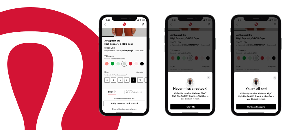
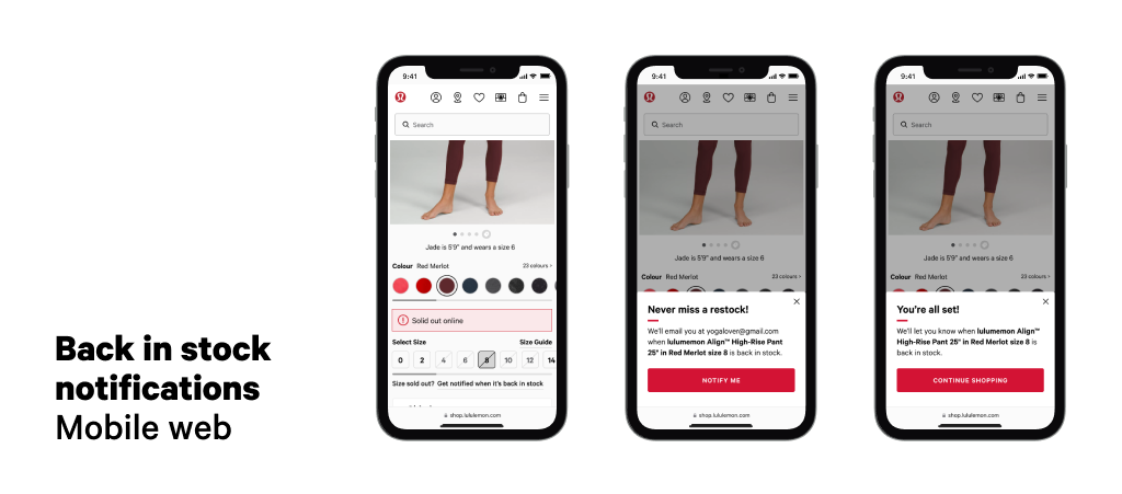
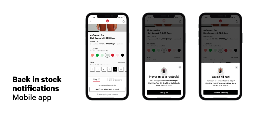
In order to ensure the notification was based on the desired colour and size, the Back in Stock feature required both a colour and size to be selected in order to see stock quantities and enable the notification to be set.
Clear actions
As one dev had commented that the out of stock size was not interactive (it was), this was considered a potential blocker to discovery. If the guest never clicked on out of stock size, the feature wasn't visible. A single line under the sizing prompts the guest to select the size, and when the size is selected, the "Get notified" action is visible. Initially there was hesitation with taking over the primary "Add to Cart" button, so we proved the feature with version one before shifting the action to an updated CTA.
Account based
Back in Stock notifications were built on the Wishlist system, and to improve efficiency with notifications, an existing alert feature was employed. This required the guest to sign into their account, and allowed for future iterations to leverage account management.
Confirmation
While it adds an additional step, we had identified with the research that customers needed a clear confirmation message when they subscribed. There was also some error handling that would alert the guest if there was an issue. Additionally an email was sent for confirmation. We opted to send two emails in total, the confirmation and the notification once the product came back in stock.
Further opportunities
The project scope and team structure did not allow a larger feature to be built, but I collaborated with other lululemon digital product designers on exploring previous pain points and opportunities raised after launch. We explored displaying back in stock wait times based on the better insights, and we looked at improving how the colourways are framed by setting better expectations around limited-edition or seasonal colours.