I created a public transit digital experience strategy
BC Transit transports more than 57 million riders in communities across British Columbia every year.
BC Transit was about to embark on a much needed website redesign but first their digital team had a lot of questions before starting. They needed to know the answers behind the analytics: who is using the site, how is the site being used, and what do those riders struggle with the most.
My role
UX consultant: create the UX strategy, or action plan, that would guide the redesign project based on the desired digital experience for riders. I had only 5 weeks to understand the existing digital strategy, business needs, conduct user research interviews, and write the plan.
Problem
BC Transit riders find bctransit.com is hard to navigate, slow, and unreliable, making completing tasks a frustrating experience.
Rider digital behaviour
BC Transit riders are seeking a variety of information, and when it comes to their most urgent tasks riders rely on third-party tools. Riders predominately use smartphones to access transit information, especially on the go.
Process
Research: the first step was to reach out to BC Transit riders. I wrote up a survey to get broad usage trends, and spoke directly to riders to get a deeper understanding with digital experience.
Stakeholder interviews: I mean with numerous teams inside the agency and learned how they fit into the website, and their struggles with the backend.
Identify pain points: I organized findings from the user research and internal conversations which were grouped and distilled to the most common issues riders faced with the website.
Strategic plan: the final piece came in the form of an action plan document covering the understanding of riders and their goals, and how to tackle the pain points.
Strategy plan
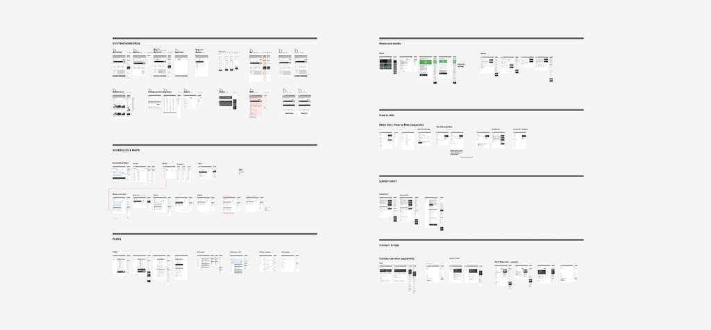
The completed covered the research, identified pain points, and roadmap for iterative improvements. The report included rider's goals, roadmap overview outlining the three phases, improvements to the information architecture, navigation, recommendations for addressing the pain points, accessibility deficiencies and remedies, correcting brand use, and consistency with UX writing.
One recommendation made ahead of the completed strategy concerned selecting a new CMS platform, and adjusting the action plan based on the replatforming timelines. While the bulk of the document covers specific usability and accessibility pain points, the strategy focuses on the priorty roadmap in three phases. The first phase addressed immediate accessibility improvements and removing unused features ahead of a necessary replatforming. The next phase outlined tackling both usability and accessibility concerns with a full rewrite of the templates.
Next steps
The strategy plan was only the beginning. With the first design phase completed in early 2024, the focus will shift to a much needed replatform in order to address many of the underlying site reliability and accessibility pain points. One feature was spun off onto a micro-site to improve stability during the next phases. With the replatforming complete, the next design phase will focus on tackling the list of experience improvements including new online tools, better scheduling and maps, and a mobile first approach going forward.
Following the hand off of the strategic plan, BC Transit engaged an agency to build the new site, and as of winter 2026, the new website is online. While it obviously deviated from the exploration within the strategic plan, those designs were a conversation starter and vision which would have needed to have been prototyped, validated and adjusted to the current reality.