17 February 2015
Cycle hire kiosk experience
Current new rental customer journey for TfL bike scheme
A few months ago I was trying to hire a bicycle from one of the many TfL cycle scheme access points and I encountered a problem which threw me. In my rush to get through the many familiar screens I performed the wrong action during payment and had to go through whole process from the beginning.
At first I was frustrated that I had had been defeated by the kiosk's UI, but then I had a further think. I returned another day and captured the process with my phone. Below is my critique of the customer journey to rent a bicycle. But first I'd would like to highlight the problem I faced when I reached the payment screen in step 10, and how it compares to step 12.
From a purely experience point of view and not considering too much the UI styling, there are some issues around consistency with messaging and the relationship with visual cues. Both step 10 and step 12 use the same graphic, a yellow & black alert symbol. Each gives the customer an instruction, one is a warning not to do something (where I failed) and the second the opposite instruction. When prompted to 'Follow card reader instructions' the warning alert makes sense that you should not remove your card. There's an additional warning under the symbol ('Do not remove your card from the device'); which is when I promptly removed my card. Step 10 has the title 'Remove payment card' and under that same alert symbol a message to 'Please remove your card from the reader'.
There are two basic issues overall which play out here. One, the dark blue title on each screen flips between giving an instruction and being a title for the content ('Please insert your payment card' versus 'Privacy notice'). And two, the visual cue on screen does not reinforce the action, and actually could confuse a customer particularly due to the repeated alert symbol.
Step 3 has a more helpful visual instruction, showing a hand holding a payment card. It could be improved with an arrow at the top of the card pointing up (toward the machine). That same image could be used in step 12 but with the arrow in reverse indicating the card should come toward the customer. As for the image on step 10, borrowing from the TfL Underground ticket kiosk, a big arrow pointing down would give the customer the visual prompt to carry on with the card reader keypad (or showing a graphic of the keypad would like wise be helpful).
The red alert text box is used in various places throughout the flow. I might be biased through my own style on projects, but I would have saved the red for danger alerts, and used another colour, such as green and yellow or blue respectively, for the confirmation and information alerts.
Some disclaimers. This is specific to the cycle hire provided by TfL. I've not had the chance to rent a bike from a kiosk in Montreal, Toronto, New York or Chicago (all of which use the same bicycles and docking stations but have different kiosk interfaces), for me to make a fair comparison. Based on limited research it appears even the Montreal and NYC stations have their own bespoke kiosk totems (the city branding and information graphics would make an interesting analysis in its own right).
Step 1. Welcome screen
Customers approach the kiosk and are prompted to touch the screen to wake it from screen-saver mode (not shown), then tap a button for their choice. In this instance the top section gives instruction: "Touch a button to start". There are also two button styles at this stage (the unique 'Hire a cycle' button not used elsewhere, and the secondary options).

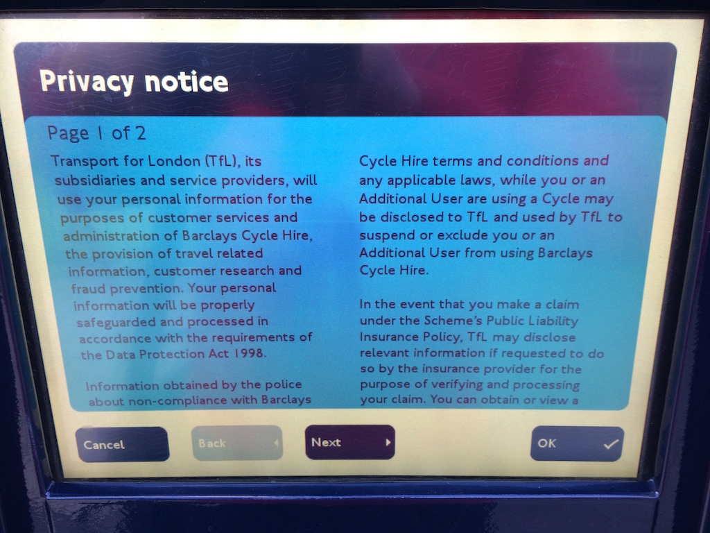
Step 2. Agree to Privacy policy
Everytime a customer hires a cycle, or returns to continue a 24-hour or multi-day rental, they are required to agree to this screen touching 'OK' in the lower right corner. The kiosk has received an update recently which includes additional screens at this stage, each and everytime. Top section now in title mode. From here on the 'Cancel' button is a pretty consistent feature but the colour could have been red to denote the type of action and to contrast it against other buttons.
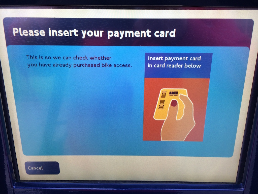
Step 3. First prompt to insert card
Top section returned to instruction mode, and here the image gives a clear visual instruction hinting to insert the card. Aside from the title, there are two additional pieces of text, an explanation why the card needs to be inserted (very good setting of expectations) and then repeating the basic instruction to insert the card except that it now adds where to insert the card. Another approach might be to title the screen 'Check for existing bike access' and next to the graphic have a single text block reading 'Please insert your payment card into the card reader below (to check whether you have already purchased bike access)'.
Step 4. Please wait
While it make be rather generic, this screen does communicate that the customer needs to wait. 'Processing your request' is in this case a bit informal and doesn't re-state what is happening. 'Checking for open bike access period' with the same 'one moment please' message might be more helpful.

Step 5. How to use the scheme
Helpful information clearly indicated carries onto another screen, could use some bolding on the headlines to help them standout, and could have otherwise been communicated as a series of graphics. While I appreciate not having to see both screens, should that need arise the 'OK' button could be removed and the 'Next' button moved into it's place.

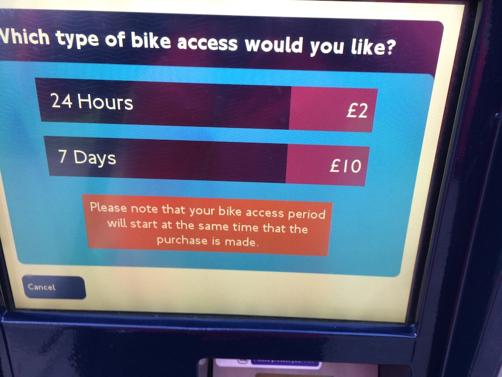
Step 6. Choose type
I suspect 'length' was too long a word and type was used. While correct, the customer is being asked 'for how long do you want to hire a bike'. Unlike the rounded corner buttons, these two buttons have squared-off corners. I hate being 'that person' but these don't feel buttony, mostly because they're not consistent with the other button styles. The red warning message is more a piece of information worthy of a blue or maybe yellow box.
Step 7. Number of cycles
Simple and clear although again the square buttons. That text block below the numbers seems important but it's not given prominent volume.

Step 8. Confirm
Helpful summary and confirmation of the purchase. Strange now that I consider this screen that all the buttons are disabled.

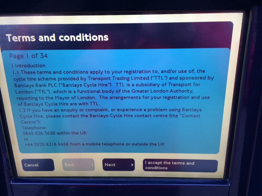
Step 9. Terms and conditions
I'm sure all customers read all 34 screens of this legal contract, or probably not.
Step 10. Follow instructions
The screen that confused me. Used to that alert I removed my card which cancelled the entire process. See above for my critique and thoughts on improving this screen.

Step 11. Processing again
Again, it's a generic screen, probably even recycled from earlier. 'Processing your payment' would be more apt.

Step 12. Finally remove payment card
Again this screen could feature an image instructing removing the card, not an alert demanding the card be removed which is similar to the alert instructing you not to remove the card.

Step 13. Success
Great reassuring image, but again a red alert text box where green would make more sense. The question should also be on its own like or bold. Unlike previous screens this is the most hidden instruction. And inconsistently the buttons are near the middle.

Step 14. Would you like to hire a cycle!
What have I been doing for the last two minutes if not to hire a cycle? This instruction could be clearer. The access period has begun, that seems important because taking out a bike later won't delay the beginning of the access period. Interesting that these two buttons use a complementary blue for the secondary information, where as maroon was used on the step 6 & 8 buttons.
